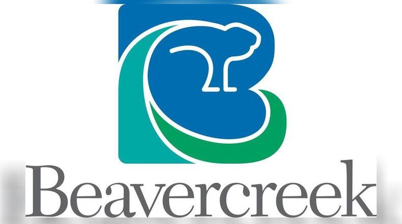
The new logo is a stylized version of a beaver as provided by Schlegel Creative Resources. The costs to the city for the contract with the branding design firm were not immediately available on Friday.
Flooding leads to costly projects around Bellbrook
“The image we want to project is that we take pride in our community and that we are a modern, updated, cool, business-friendly, family-oriented city, just a great place to live work and play,” City Manager Pete Landrum said in a prepared statement. “By utilizing modern and updated colors and font with a new twist to the beaver, the new logo says all of these things.”
The city’s unveiling of the logo on Facebook generated nearly 100 comments and six shares in about eight hours. While some commenters complimented the city’s work and gave their approval, many issued criticisms, calling it a “disappointment” and “a waste of time and money.”
Landrum said in a phone interview Friday that the “feedback of this sort is well expected.” He said the branding firm warned there would be negative responses and recalled the reactions Fairborn officials saw when they updated their city’s branding.
“A lot of thought went into it and there was a lot of input from council,” he said. The city also received input and recommendations from a local artist and a graphic designer, according to the release.
The city plans to use the logo in its digital communications and social-media profiles. The stone monument signs around the city won’t change or be replaced. The sign dating back to 1980 that sits between City Hall and the police department will be updated, Landrum said.
SCR’s Dan Schlegel said in a prepared statement “The strength of any brand is its consistent use.”
“The development of this new brand helps build a strong unified image of the City of Beavercreek,” Schlegel’s statement reads.
About the Author
